The Design Research
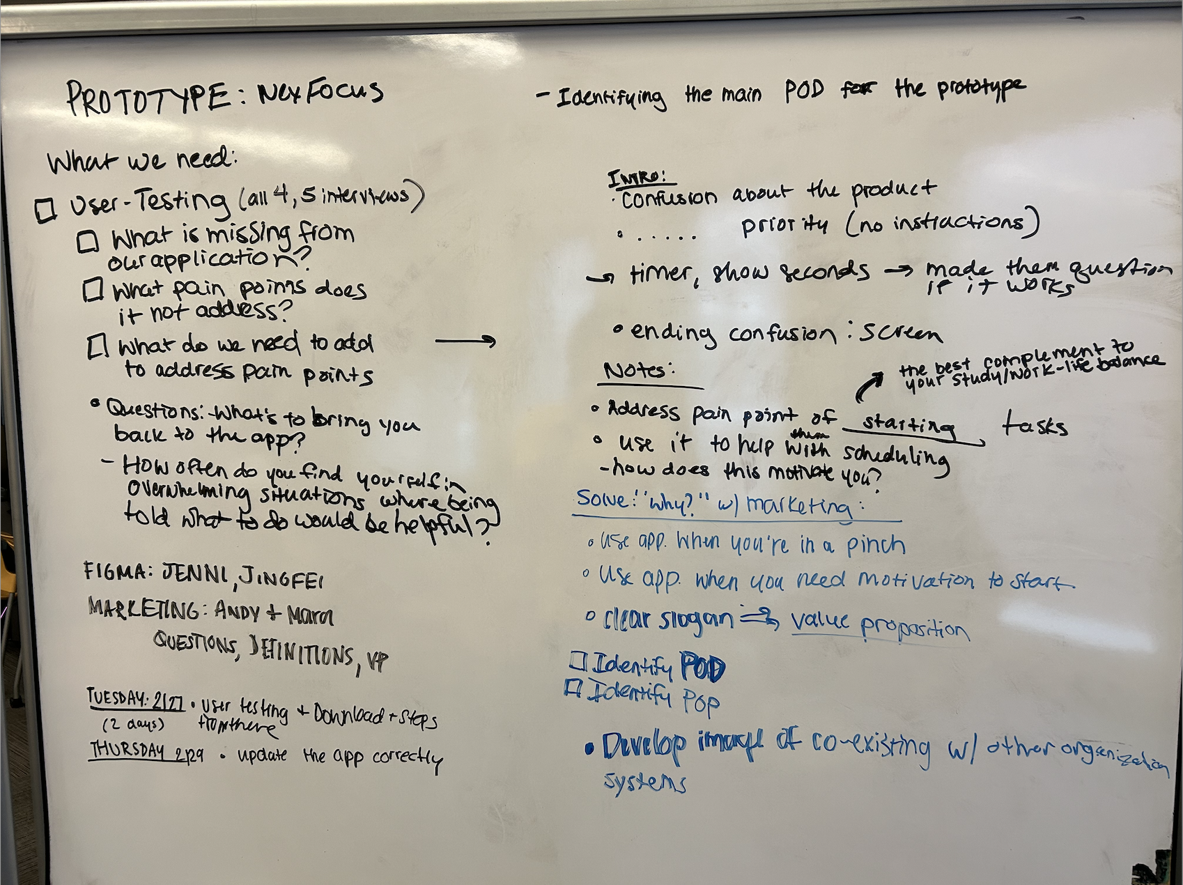
We identified three key areas of improvement based on interactions with our low-fidelity prototype.
Switch back and forth buttons
- During testing, users struggled with navigation due to the lack of a back button.
Accessibility
- Originally, we used color coding to denote the importance of tasks, with red indicating the most critical and green the least. After testing, we recognized this was not accessible to color-impaired users, so we included text labels alongside colors to ensure all users could effectively prioritize tasks.
User interface
- Initially, we offered users options like “Relieve stress” and “Pass time” to choose their preferred working mode. However, feedback showed confusion about their meaning and actions. So, we understood the need for clearer definitions and guidance.

Changes in Design
Phase 1
We shifted from paper prototypes to Figma interfaces. Within Figma, our team developed the entire interface for our time management app, focusing on the iPhone platform.
Phase 2
We provide time options for “Focus on one task part”, but for multi-tasking we set the time for 25 minutes per round. This is based on our research, pomodoro techniques usually have 25 minutes for tasks and break time for five minutes.
Phase 3
During mid-fidelity user testing, participants interacted with our app prototype on Figma and provided feedback. Following, we resolved text input and timer functionality issues.
Phase 4
Throughout our high fidelity design, we were mindful that we encourage our application to be used alongside other task management tools students currently use.


The Inspiration

Instructions
Step 1
Say hello to Emmett, from NexFocus
Enter your top 4 tasks and assess their priority based on your first thoughts.
Step 2
Assess your environment and answer honestly. If it’s a no, see what you can do first to get yourself in a place where you can study.
Step 3
Determine if the plan is to focus on one task (recommended for high stress scenarios) or random task generator (to cross off your to-do list)
Step 4
Give us an estimate of how much time you have.
Consider… can you get the task done quicker?
Step 5
Receive your task, check your timer, and get started!
Totally doable, right?

